Q1 In what ways does your media product use, develop or challenge forms and conventions of real media products?
My music magazine uses and develops codes and conventions that you would find in a music magazine such as Jazzwise and JazzTimes, NME, Q magazine. I have researched a lot of different Jazz magazine to help me with my planning but I particularly focused on two magazines Jazzwise and Downbeat. I thought the layouts of these magazines were executed well and made the magazine looked very professional and it’s also eye catching. The main picture and the camera angles used were very effective. I used these too magazines to help me plan. However looking at the main artists that were used for both the Magazines Downbeat and Jazzwise, I didn’t like the fact that only older artists were the only one’s featured on the front covers of the magazines. The colour’s that are for example the Red colour that has been used for Jazzwise magazines masthead stands out from the white background and the white colour that was used for the masthead for Downbeat magazine also stands out from the reddish-brownish background. This draws the reader’s attention and red is an eye catching colour.


I did come across other jazz magazine which I was very disappointed about for example Jazz magazine, which has a very plain front cover and does not follow the codes and conventions of other magazines in contrast to other music. It only has one cover line and the title and the main image is the only thing that is slightly eye catching, apart from that the magazine looks boring even though Jazz is meant to have that relaxed feeling but it loses that excitement Jazz is meant to have. After looking at all these magazines I have used them as a guideline to improve the look of Jazz magazines.

I did come across other jazz magazine which I was very disappointed about for example Jazz magazine, which has a very plain front cover and does not follow the codes and conventions of other magazines in contrast to other music. It only has one cover line and the title and the main image is the only thing that is slightly eye catching, apart from that the magazine looks boring even though Jazz is meant to have that relaxed feeling but it loses that excitement Jazz is meant to have. After looking at all these magazines I have used them as a guideline to improve the look of Jazz magazines.

When creating my music magazine I had to think about how I was going to represent particular social groups for my magazine. From looking at some magazines I have noticed that the colour’s used are white, red yellow, blue, green and orange are very bright colour’s but there are a lot of other magazines that just use the colours white, black and grey, that are used by many Jazz magazines. I decided to use 3 colour’s white, baby blue, black and pink on my front cover, therefore this shows that I have broken the codes and conventions of a magazine, as normal magazines only use three colours. The reason for this was because I wanted the writings that will appear on my front cover to stand out from the grey colour which I have used as a background. Also because my target audiences are both genders, so using the colours pink, blue, black and white which are uni-sex colours I am attracting both of genders. I have used the colour pink instead of red as red is used a lot in magazine pink isn’t often used. I have chosen bright colours because my target audiences are young adults and I feel that it will appeal to them more than using dark colours there for making my magazine look more youthful but still classy. The colour’s are not in your face therefore giving it that elegant and relax feel. The forms and conventions that I have used that are seen in most magazines are placing the mast head at the top of the page and making I the largest font on the page, having one main image on the front cover and it being a medium shot. The other conventions that I have used are placing cover lines next to the picture and on the picture. I do feel like I have challenged the code and convention of a Jazz magazine because most Jazz magazine have their artist playing an instrument or holding an instrument, along with cover lines of other artists informing the reader what they should expect inside the magazine. I used one of the techniques by placing the cover lines next to the main image; however I only placed all my cover lines on one side which is on the left. The reason for this is because not all magazines follow this formation and the other reason for doing this was because if I placed cover lines on the right side, the audience will not get to see the instrument and the instrument is an important part of the magazine. To avoid this I placed all cover lines on the right. I developed this idea by placing the instrument behind the model but making it still visible to the eye of the audience; I did this so that my magazine will be different and unique. This will catch and draw the audience in as they are use to seeing the main artist pretending to play an instrument or holding it and this is what a magazine meant to do draw the audience in. However, at the same time I feel that the instrument could have been made more visible and could have played more part to the cover. I feel like the instrument and the main artist work together but at times it just looks like two individual pictures. I placed my barcode on the bottom right side instead of the left as it were most bar are placed and also I could place the barcode on the left because there was no place for it as my cover line took up all the space. Another way that I have challenged the codes and conventions is by not placing my issue number and date together, I placed the issue number underneath the masthead but on the right and the date on the left of the masthead. I did this just to fill up the empty space on the page, as I felt that having the date and issue number together at the top page on one side makes it over crowded there separating it makes it less crowded. I did also separated my barcode and price and I placed it right next to the masthead because it would make it easier for the audience to find and not have them spend time trying to find out where the price is. I placed my tag line at the top of the page above my masthead because I feel that my tagline is also as important as the masthead.
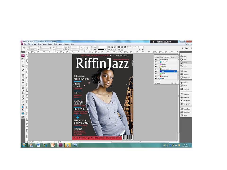
For my draft I called my magazine Riffin, this is because I wanted my magazine to stand out more. So by giving it the name of a musical terminology used within that specific genre gives this affect. However, even though I did a research of this name to see if any other magazine has the same name, at that point in time I didn’t come across any. But, when I was planning my final front cover and what I should change I decided to do more research, unfortunately I came across a magazine with the same name which was a disappointment. Therefore I had to change my name because my magazine need something jazzy so I decided to add the name Jazz at the end of Riffin so my masthead became Riffinjazz. I feel like my masthead is straight forward and simple which is what I want to get across about my magazine, I also think that my title reflects the magazine. I placed the title on top of the picture because most mastheads are behind the main image and I wanted to go against that and placed it at the front. I think it works and at the same time doesn’t because I feel having the masthead behind the artist it’s like the masthead is hidden and I didn’t want that so I placed it on top. However, placing it at the top of the image makes it look great but at the same time the jazz is over the artist face. Which effects the image and looking at it now I feel like it will look better at the back.

It was really hard to find jazz magazines contents pages but I did come across this content page. The reason I did this was to identify the characteristics of a contents page. I did follow the conventions of this magazine. When creating my contents page I did use the cover lines which appear on my front cover, therefore identifying the language that proposed the magazine being all about Jazz. I have used a lot of tasters on my front cover, contents page and double page spread which I used to draw my audience attention
My contents page imitates most code and conventions used in other magazines. Looking at the Jazzwise magazine you can see that it has been divided in to two sections, features and regular articles with a small summary of what the feature is about and page number. This makes it easier for the audience to read and know what they are actually looking and what page to find it. I followed this technique but add my things to it. I add a column’s for tasters and reviews. The tasters that I used informs the readers what’s going to come up in next month’s magazine their making the reader want to buy next month’s magazine. I have used five different pictures on my contents page. I add new pictures of other artist that are named under my feature column. This just gives the reader an idea of who these people are and what they do. I did make these pictures smaller because they were not as important as the main cover story. I made the artist of my cover story the largest picture on the page because she is the most important and she needs to catch the audience eye and make them want to read on about her and other artist in the magazine. However, I do feel that my smaller pictures should have been of a better quality as they look a little bit blurry and my

layout should have been better than I have done it. I did keep to the same colour scheme as my front cover because when I didn’t stick to my colour scheme for my draft magazine it looked like a completely different magazine and I didn’t want that. Keeping the colour scheme the same allows the audience to see the connection between the magazine and contents page. On the right at the bottom of the contents page, it tells the reader how to subscribe to get my magazine and how to get tickets for new gigs. I also added the website of the magazine which will allow the audience to visit the website and get more information.
Q2 How does your media product represent particular social groups?
My photographer are mostly medium shots apart from my double page spread were I used two long which allowed me to deliver a complete body language of the artists. For my front cover, contents page and double page spread I took a studio shot of my main artist. The reason for this is because she was the most important and I wanted that to come across and I wanted her image to look striking. I thinking this decision of taking the picture in a studio and with a professional camera allowed my magazine to look professional and appealing to the audience. However, some pictures that appear on my contents page and double page spread are taken from a live show, which I think will engage the reader attention and allows the audience to see their performance on stage and also inform them do with their talents and also to make the reader feel like they are at the show and also making them want to attend shows like this.
I tried my hardest for my all artist in my magazine to wear clothes that will represent the genre of the magazine and also the music they play for example, Blazers, scarf, polo shirt, smart jumpers, coats, smart tops. Jazz artist in a normal Jazz magazine always dress in a smart and classified way which also helps to portray the genre and this is what I wanted for my magazine and that is why I followed this technique. This use of props saxophone, clarinet and microphones in my magazine helps to covey the genre of Jazz and identifies what each artist do.
All the artists that I have used in my magazine are of different age some young and older. As normal jazz magazine always target people that are above the age of 30 or 25, I think that’s the reason why younger people not know a lot about jazz and are not interested in Jazz because they think it’s for older people. The artist all feel confident in what they are wearing, which gives them that sophisticated look. Knowing this I decided to target the younger generation from age 18 and above so that the reason why I have used younger and older artist. My magazine still appeals to the older targets audience that a normal jazz magazine will but targeting the younger people will bring more customers and more audience.
The written style content that I have used to in my music magazine overall is formal. I think that this style appeals to my target audience because the genre of a Jazz magazine is formal but it does have that relaxed feel to the magazine as I didn’t want my magazine to be difficult to read. In the entire magazine there is a lot of text than pictures especially in my double page spread as the audience would want to know more about the artist, current issue and not just look at their picture. However, I do still feel that the images still play a large part.
Q3 What kind of media institutions might distribute your media product and why?
I think that the institutes that will distribute my product are IPC Media which is one of the biggest companies in the UK with their products reaching nearly 26 million adults, maximum exposure and national distribution that my magazine would need to produce a worldwide net profit. Bauer Media who has a successful market that sells over 300 different magazines in 15 different countries. I think that these two companies will publish my magazine because of the uniqueness and professional standards of my magazine and I will also bring this to the institutions. I think that my music magazine product will be successful as because I will be bringing something new to the Jazz magazine for example no other Jazz magazine has produce their products for people from age 18 but mine has. This means that there is huge gap in the market that could b by my product, and I will be bringing fresh and new young audiences to their market. I would also want my magazine to be published in store like HMV and Music 47 as these stores both cater for music from any genre. In these music stores it will be easier for me to target my right audience as people who are interested in Jazz music go to these stores to buy magazines and a lot more other things. This also means that my magazine might attract other audience that come to these stores and will see the new and fresh look of my magazine and would want to buy it. I also think that the use of subscription on my contents page will help with the sales of the magazine because I will have on going customers even if there were changes to the magazine or company.

I will not only rely on m
I will not only rely on my magazine being distributed in stores but also on the internet as well so that jazz fans and all my audiences will be able to purchase my magazine. I will have my own homepage www.riffinjazz.co.uk they will be able to check previews of next month magazines, how to get latest tickets for gigs and get more information about the magazine and how to purchase the magazine.
y magazine being distributed in stores but also on the internet as well so that jazz fans and all my aude.
I will have my own homepage
www.riffinjazz.co.uk they will be able to check previews of next month magazines, how to get latest tickets for gigs and get more information about the magazine and how to purchase the magazine.

By IPC and Bauer Media being large distributor, this means that they will already have large distribution deals with major high street retailers and newsagent distributors such as WHSmith and Tesco. However, along the line I do think that these company will stop thinking about the content of my music magazine to the reader and start focusing on the on the profit of my magazine. But I could also use synergy which will allow my magazine to increase some of it profits. That is why I have created my own website so that customers will be able to use this website I will be able to do advertising, special offer, CD’s and competitions to get my audience tuned which I believe will generate large exposure for my magazine.
Q4 Who would be the audience for your media product?
My audience for my overall magazine is both males and females aged 18 and above also from all different races. The reason for this is because from my research most jazz magazine out their target people above the age of 30 or sometimes lower but never below age 25. In my magazine I have use two young artist and one older artist and I also think that the main artist that I have used for my front cover, contents page and double page spread can appeal to both young and old because even though she looks young there is a sense of maturity seen with her even the ways she is dressed (smart jumper) relaxed and calm also she has that classy look. Whereas in other magazine that are aimed for younger people they are dressed differently they which shows their youthfulness. Even though my magazine has a more mature feel to it I did this because I still wanted to keep the older audience because if I make the magazine too youthful I will lose them and they wouldn’t be interested in my magazine so I had to combine the two together. The price of my music magazine is £3:00 as it’s an every month issue magazine; this allows middle class people to able to buy my magazine and also students at the price. My music magazine is targeted at people who have a great interest in to the jazz world and people who don’t because even without interest I think that people can still relate to it. Also me featuring young artist in my magazine is also successful for me because now a days large producers are looking for young artist to work with and this will make them want to buy my magazine and also bring great publication.
These two pictures are an example of young youth that I will target for my music magazine
My other target audiences are Chris Potter and Esperanza who are very popular in the Jazz world. I think that they would want buy my magazine because it features new young artists and older artist but I think because they are older and they might want to know what is going on in the Jazz world and who they are up against with their music and also the might want to do a collaborations with the new upcoming artist which will help them and the new artist.


Q5 How did you attract/address your audience?
The front cover is the most important out the contents page and the double page spread I think because if the front cover of your magazine is not able to attract any audience then you will lose profit and sooner or later you will be dropped by your institutions because your magazine is not selling. I used bright colour’s such as pink, blue white and black which stood out perfectly from the grey back ground. I chose to have my background grey because everything else was bright I didn’t want the magazine to lose that old and classical feeling and also a lot of jazz magazine use this colour as it does portray the feeling of Jazz. This colour scheme run throughout my contents page and double page spread
I think the other colour grey dulls the other colours down and I like this effect because I didn’t the colours to be in your face and loud. Jazz is not loud or in your face so I had to be very careful in the way my magazine comes out to the audience. I also think that it give the magazine an authentic and mature aspect to the magazine. I used the font Narkisim for my masthead which was very effect as I feel it has a jazz fell to it and I also made it the biggest image on the page in white, so that it will attract the eyes of my audience. I also feel that not many people know what Riffin means on less they play instruments and work with musical note. However this can be both negative and positive. On the positive side people who will see the name of my magazine and don’t know what it means would be interested to read my magazine to find out. On the other hand, some people because they don’t know what it means will not both to find out. I have used a lot of tasters on my front cover and contents page. On my front cover I placed one taster next the artist face and next to the masthead because it will easily catch the reader’s eye and the title and the picture is what the reader reads first. However if the reader does not read the title first I placed another tasters on the bottom strip of the page, either way one of the taster will draw the readers in.

Q6 what have you learnt about technologies from the process of constructing this product?
It was very hard to construct my music magazine as I had never used Adobe InDesign or Adobe Photoshop. However, after a tutorial form my teacher and class mates who have used this program before of how to do the basics on each program. It wasn’t as hard as I thought it was and I got the hang of it. I think that when it came to doing final music magazine I was a lot confident than I was when I did the draft. Adobe InDesign is where I created my magazine and I only used Adobe Photoshop to crop and add effect to my pictures. I feel that I have used my columns more effectively than I did in my primary task and daft music magazine. I had to use a lot of columns in my double page spread to separate the question from each other also to make it easier for the audience to be able to reader the article much easier and also to make the page look professional. I have also learnt that naming your layer is very important, even though I was told over and over again by my teacher to name my layer, I still didn’t listen to her instructions which I paid a price for allowing the way when creating my music magazine. There were times when I will would want to move a text but didn’t know to layer to click on to be able to move it and I will end up moving another text that I really didn’t want to move. Then I will have to waste more time placing the text back in to its position when I could have moved on to something else. So I’ve learnt that naming layers are really important when creating a magazine. I would say that the lasso tool in Photoshop was a great help but it meant that you have to have great patience which is essential. When using this tool it is easy to do thing wrong because it very fiddly and editing the background of my picture too a lot of my time but it was worth it as I wanted my picture to come out great. I do think that the edges of my picture could have been better by using other tools but because I was only comfortable with the loose tools that let me down a bit. In these programs I also learnt how to add different shapes, add colour, create columns, place a picture and add text. I also learnt that you are able to create anything in both programs you just have to know how to do things.
I also learnt how to use blogger more effectively and thing that you could post on your site for example Slide share and Youtube. I also used blogger to display every piece of my coursework that I have done and I have found that it has a great professional appearance with a usable interface. It was really easy for me to edit and post.

The ability of Blogger to be able to connect it was easy to edit my posts and create a good theme for my blog. Its ability to connect without obstruction to other sites such as Slide Share.
Q7 Looking back at your preliminary task, what do you feel you have learnt in the progression from it to the full product?
I feel that without me doing any research and planning, the finished product of my music magazine would have been very disappointing and low quality. From the feedback that I received from my teacher on my preliminary task then new that I had to put a lot more effect and work in to my music magazine design than I did with my preliminary task. I would say that I did great amount of research for my main task than I did for my preliminary task, by closely analysing existing music magazines such as Jazzwise, Vibe and NME, therefore I was able to create a very strong and presentable brand identity which I think distinguishes my music magazine from others jazz magazines by using different technique in my content and layout. During the process of creating my music magazine getting a feedbacks from my teacher and classmate was very important when developing my magazine. Listening to their feedbacks helped me to create a better magazine that will appeal to my audience.
In order for me to be able to get and create that professional look and feel that I wanted for my magazine, my skills to be able to use Adobe Photoshop and Adobe InDesign in terms of understanding its tools I needed to be developed in a lot of ways. During the process of creating my music magazine I learned how to manipulation my pictures for example by changing my pictures to black and white to have that old effect that Jazz has and using contrast adjustment and focus to get a high quality picture.
From my preliminary task I then knew how important it was for the front cover of my magazine to look great and powerful as that’s the first thing the audience is going to look at and will make them want to buy the magazine after reading it. I used a lot of examples from magazines that had already existed the reason for this was to get a better understanding of the magazine world. Looking at these magazines over and over again allowed me to create a magazine at a professional standard. Looking back at my contents page for my preliminary task contents it wasn’t anywhere near professional standard or even an ok standard. My music magazine final contents page I would is 100% better than my preliminary task because I have included more pictures whereas I only used one picture on my preliminary task contents page and also I never used tasters to draw my audience but in my music magazine I used a lot. On my front cover for my preliminary task in had a lot of empty space where my front cover I tried to cover as much space on the as possible. I also noticed that I didn’t use my lay out of my cover lines properly on my font cover for my preliminary task it was all over the place and also it covered most of the picture. Whereas on my music magazine I tried to keep my cover lines from my main image so that the audience will get to see the main image properly. Also I noticed that on my preliminary task front cover my main model didn’t have eye contact with the camera so therefore lost the relationship it’s meant to have with the audience so that why for my music magazine most of the artist that featured in in the magazine had eye contact with the camera so a relationship will be developed between the artist and the audience. Due to the fact that I never did a double page spread for my preliminary task so I will not be able to do a comparison.


 Again due to the fact that I didn’t like the way my first draft magazine looked like I start from scratch. I have changed my colour scheme and layout liked I did to my front cover. I have kept the same colour scheme that I used on the re-draft of my front cover because then my front cover and magazine can be linked together. I have changed the heading layout giving it a pink and blue backdrop and plus I place a picture of my front cover on the top left. This is to remind the reader what my front cover looks like. I have also added more cover lines columns for example reviews and tasters instead of just have features and regulars like I did on my first draft of my contents page. I removed the picture of the artist holding an instrument the reason for this is because I felt that it didn’t look professional and I didn’t take the picture properly. I also used a line to separate my columns because I wanted it to be easy for my audience to read. I changed the main image of my cover story because I felt that the picture I used on my first draft lost connection with the audience as she was looking directly into the camera but for my re-draft she is looking directly into the camera therefore creating a relationship with the audience. I also add subscription to the re-draft my contents page which will allow the audience to have special offers and also insight into the next month magazine and this is also a create way of getting more audience as the audience will be getting it for a cheaper price. Therefore they would want to buy my magazine. I have also changed the bottom strip by adding more tasters on the bottom strip on my contents and a picture tickets. This is to get my audience to engage with the magazine and also to make they want to buy next month’s magazines in order to get this price.
 When re-drafting my music magazine, I decided to start from scratch because I felt that I didn’t meet the professional standard of a music magazine. My front cover was not that creative and I didn’t spend a lot of time on it than I should have. I wanted to attract younger audience for my magazine but I have failed to do that because I have used an image of a much old person. However, in my redrafting I feel that my magazine has reached a professional standard and I feel that changing my main image will allow me to target a much younger audience but also keeping older audience interested also as they are more likely to buy jazz magazines. Changing my colour scheme and background colour, I think was a good idea because it allowed me to explore more with my colours and also to find a colour that will look appropriate and professional that will make my audience want to buy my magazine. My front cover magazine have developed the form and conventions of a real music magazines because I have taken ideas from music magazines that I have researched and studied for example Jazztimes, Jazzwise, Downbeat which are popular jazz magazines. These magazines have used one artist on their front cover of the magazine, of the artist playing an instrument or holding or no instruments at all. I have developed this by my artist not playing or holding an instrument but being placed next to an instrument, I did these in because I wanted my magazine to look unique as no other magazines have done this before. I think this is a good idea as it will catch my audience eyes as they are also looking for new treads to follow and this could be it. Even I have not used the same name as other as other jazz magazines; I have used the same white colour this is because I felt that it stands out better than from my background and it a colour that will catch your eyes from a far distance. I felt that my colour scheme that I used in my first draft was too crazy and busy and jazz is all about simplicity and I think that I have lots this affect, and also in my layout. But changing my colour scheme to white, blue, pink and black I felt that this works better that also because I wanted to challenge the codes and conventions of the real music magazines and not only use three colours therefore making my magazine different from others. I changed my unique selling line because it was similar to what other magazines have on their front cover, and this will make my magazine different from others and also telling the audience that my magazine is the only one that will give them this feeling of jazz. I added more cover lines of artist because I feel that the audience are more interested in who is going to appear in the magazines and what they are up to but I changed the layout because I felt that in my first draft my main cover line did not stand out from the other cover lines therefore my audience will not be able to link my main cover line to that artist so by moving it away from my other cover lines it can be easily identified.