WEEK 7
This week I started my research on music magazines which will enable me to complete the next task, which is to create a music magazine front cover, contents page and double page spread.
Here is a mood board which I have created in Microsoft word office and pictures from Google which includes most of the music magazine that I came across when researching.

From my research, I decided to just focus on three different genre music magazines because there are quite a lot of magazines out there. The three genres which I have chosen to focus on are Hip Hop, Jazz and Indie/ Rock.
The first magazine I focused on was NME (New Musical Express) a monthly magazine. When NME was published in 1952 it was a music newspaper eventually became an actual magazine around the 80’s. However, in the 70’s it then became the bestselling music magazine. It was the first British paper to include a singles chart, in the 14 November 1952 edition. As the years went by NME music magazine change it genre, in the 60’s towards the 70’s because of the growth of Rock music. Therefore replaced pop its first genre, adding also punk music as it was also popular at that time. NME magazine do include other genres of music for example Hip-hop, Rock and R&B, even though its genre is Indie/Rock. The editor for NME magazine is Krissi Murison and it also belongs to the company IPC. NME target audience are young adults that take interest in different music age 17-30, its main target are men because male 73% and female 27% and its price is £2.20 which might such that their aiming at people that are middle class – lower class for example young adults are socio-economic categorisation is ‘E’ as some of them will be are students. We know that it targets both genders because the musicians that are used on the front cover are male and female.


NME has used Mark Ronson as their main musician model for their front cover. This image is a medium shot image that was taken from a straight angle and then placed slightly off centre towards the right in order for the cover line and mast heading, main cover line to be written. He is looking straight in to the camera with a weird look and with a broken trumpet in his hands. This makes the picture look more comedic. The image that has been used is very important and has been used successfully because they have used a model that is young it will appeal to their target audience also because the readers can relate to him as they are in the same age band. He is the largest picture shown on the cover which shows that the magazine aims to draw maximum attention to him.
The magazine title NME s (New Musical Express) connotes it trying to find the next musical trend. It relates to the target audience who are always trying to follow the next new trend. It is the largest text on the page which is behind the main image. The use of the bright orange makes the mast heading stand out and draws the reader’s attention. The main cover line matches with the mast heading, it simple and draws the reader attention. The model’s name Mark Ronson is in bold block letters tells the reader who the main model and a little what the article is going to be about. On this front cover there is not as much cover lines compared with other ‘NME’ front. The sub heading on the front cover, tell the target audience a little bit about what the magazine will contain, and interesting facts, stories.
‘Vibe’ magazine was the first full colour English language magazine which was published in Madrid in September 2006, as a monthly magazine and was found by producer Qunicy Jones. The magazine genre was R&B and Hip-hop and it’s not only a music magazine but also an entertainment magazine. However in the summer of 2009 Vibe production was shut down and was then purchased by a private investment fund InterMedia Partners and it is also now issued in double covers. It has a bigger online presence, aid by the ‘Vibe’ Lifestyle Network, which is a group of entertainment and music website, which is under the ‘Vibe’ brand. ‘Vibe’ magazines mostly young urban people that follow the Hip-hop culture.
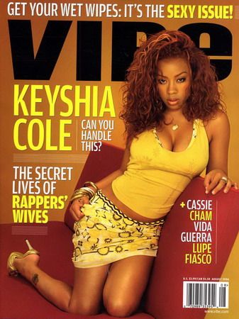


The masthead ‘Vibe’ is written in sans-serif font in white. This style of the magazine appeals it’s young audience, and gives the magazine a modern feel, the colour white is very sharp and stand out from the black background. The word ‘New’ is written in the top left hand corner of Vibe in the black and yellow colours, this draws the reader attention to inform them that it’s the latest or newest addition of the magazine. The masthead is placed at the top of the page as that is all that can usually been seen when it’s on the shops shelf. Drakes’ head is covering part of the masthead. This shows that Drake is dominant over the masthead and he is the selling factor of the magazine and not the masthead. The authors of Vibe are that confident that the audience can still make out what the masthead says; this is only done by well-established magazines. In this magazine the articles do not anchor over the main image, as seen in other magazines. Due to the fact that everyone knows who Drake is it’s easy to match the cover line with the picture without the cover line been written over the picture. The cover lines have been written on either side of Drake to fill up dead space in a smaller font to the main cover line and masthead. This magazine has followed the code and conventions a music magazine by using three colours. The cover lines are placed on the front cover to inform the reader what articles are going to be featured in the magazine. The lead article ‘Hip-Hop’s New Religion’ shows how highly Drake is valued. It creates mystery for the audience making the audience eager to what to find out more about the artist. ‘Exclusive’ is written in bold in the font ‘San-serif’ this is to draw the reader’s attention to the fact that this article with not be featured in any other article but ‘Vibe’. ‘Vibe’ has collaboration with twitter, therefore by mentioning Twitter on the cover will help to promote twitter and the magazine, gaining more audience for the company and magazine. The website of ‘Vibe’ has been placed on the front cover so that their target audience will be able to visit the site and get more information about the magazine, subscribe to monthly service and news.

The target audience for this magazine are age 30 and above. ‘Music’ magazine genre is classical which is sometimes cooperated with Jazz or sometimes infused with Jazz. The magazine has a relaxed feel to it, as it has a plan and basic background. This magazine has also followed the code and conventions of a magazine for example the use of three colours black red and white. They have used a female model as their main image holding a violin in a bright pink top with hints of blue and white. Her facial expression is very inviting and engaging as she is smiling and shows that she was looking directly in the camera. Her holding a Violin informs the audience what she does and how much she enjoys playing it by the way she holding it. The layout of the magazine is very basic because it has less cover lines compared to other magazine therefore leaving blank spaces on the cover. The masthead is placed across the top of the magazine in red behind the model. Although it’s placed behind the model it doesn’t lose its effects it still stands out and I think that why they used the colour red that it’s eye catching. On the top let hand side of the magazine the yellow circle that say ‘Free CD’ this is to attract the reader’s attention so that will by the magazine to get the free CD inside . This CD is a reward for the audience buy the magazine. Also another thing that will entice the reader in to buy the magazines at the top of the magazine, where it says ‘the world’s bestselling classical magazine’ which has the BBC logo next to it this informs the reader that this magazine is the best and their no other magazine like it.
posted by fofanaha9630 @ 13:36
0 Comments
![]()

0 Comments:
Post a Comment
Subscribe to Post Comments [Atom]
<< Home